Case Study
Details
Product:
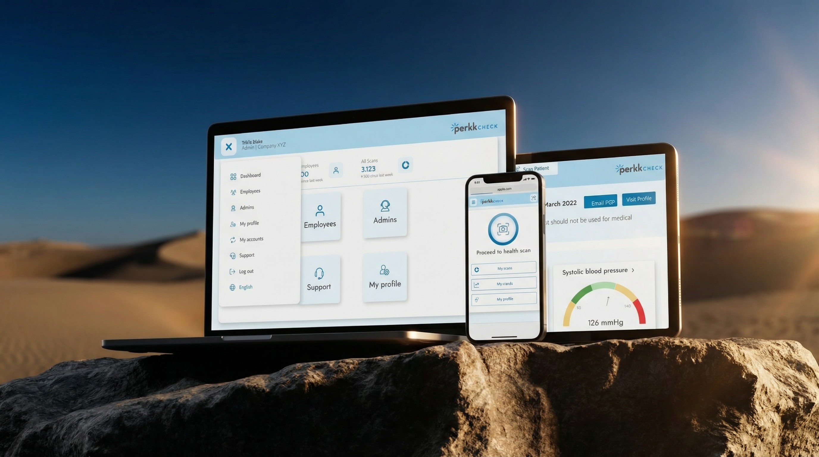
Perkk Check
Role:
Senior Product Designer (sole in-house designer for most of tenure)
Stack:
Figma, FigJam, Miro, Storybook, Userlytics, UserTesting, Jira, Confluence, Slack
Constraints:
Trust-sensitive domain, sensitive health info, rapid delivery cycles (1–3 weeks), multi-role complexity
Brief
Perkk Check uses a short, camera-based assessment to generate health and wellness indicators. When I joined, the scan technology and indicators were established, but the product was early in experiential maturity. The UI was functional but inconsistent, and the growing feature set was beginning to impact clarity and scalability. My work focused on building stable design foundations and evolving the experience from reporting results to supporting understanding and action.
Overview
The foundation was there. The experience needed structure.
Perkk Check operates in a healthcare context where trust, clarity, and reliability matter. Users interact with sensitive personal information and need to understand outcomes without second guessing the system.
At the time I joined, the interface supported core functionality but lacked consistent patterns and scalable structure. As complexity grew, it became harder to introduce new features without increasing inconsistency and user friction.
The Problem
Where the experience broke down: interpretation and follow-through
Perkk Check could generate a large set of wellness indicators from a short scan. But the experience asked users to interpret a dense results screen with little prioritization or guidance. In a trust-sensitive context, this created two issues: users weren’t sure what mattered most, and many didn’t know what to do next. The product needed clearer structure for interpretation and a more direct path from insight to action.


Insight
Users could see detailed indicators, but they still had to do the hardest part themselves: decide what mattered, and what to do next. In a health context, that gap shows up as hesitation or inaction. The direction was to make interpretation the default and connect it directly to a next step—without removing access to the underlying data.
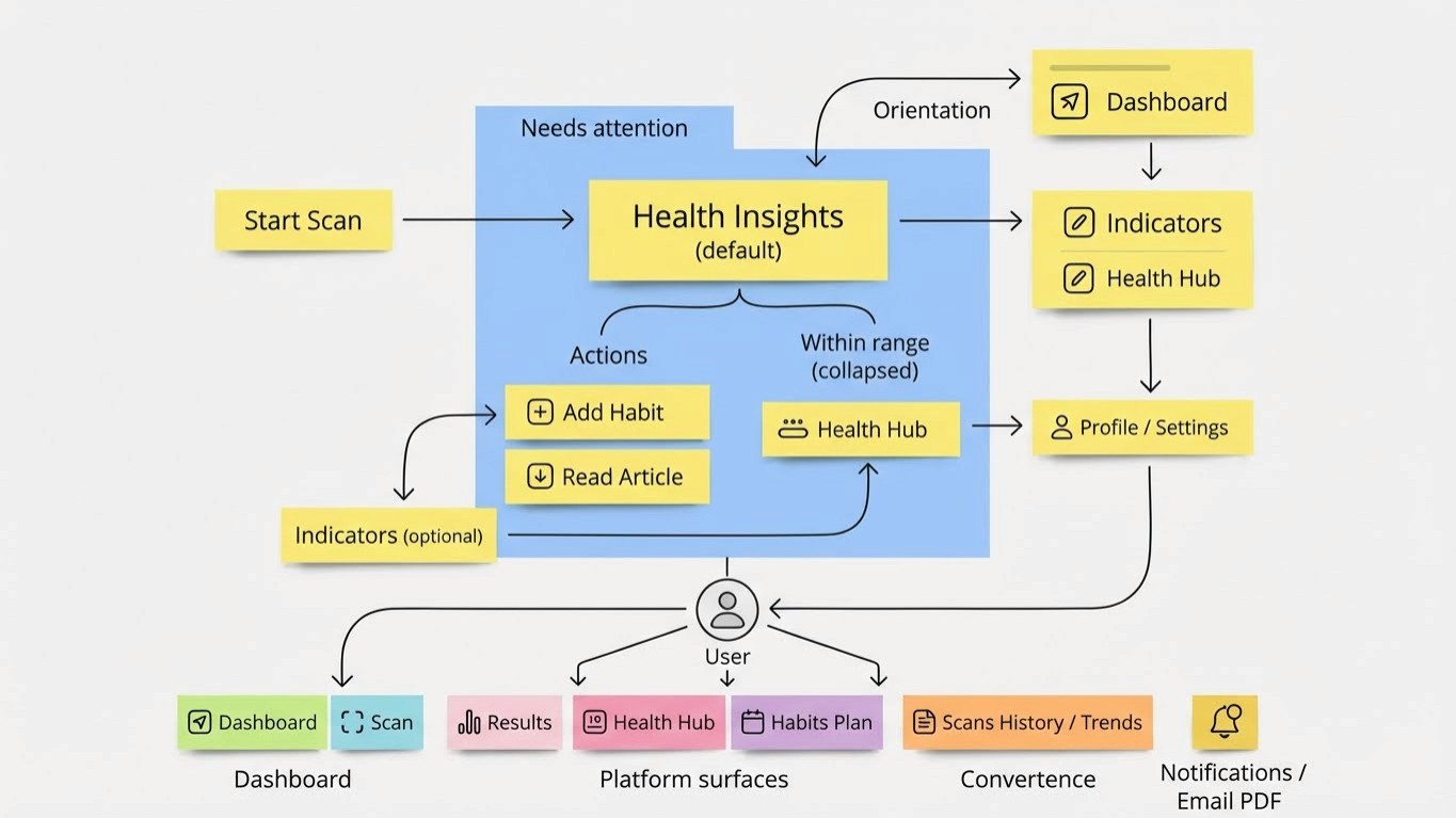
Scan → Insights → Habits → Repeat
Design direction
Rather than treating this as a screen-by-screen redesign, I worked from system decisions: consistent structure, predictable patterns, and clear information hierarchy. The goal was to make results understandable at a glance while keeping detailed indicators accessible when needed. These changes weren’t delivered in one release. We introduced improvements in small increments, shipped them, and used usage signals and feedback to refine the next iteration. The screens you’re about to see represent where the product landed after that cycle repeated across the dashboard, results, and follow-through features.
System principles
Keep the experience simple under complexity: default views reduce cognitive load and remove unnecessary decisions.
Surface what matters without creating alarm: concerning results rise to the top; everything else stays collapsed but available.
Pair every signal with context and a next step: results explain “why this matters” and lead to an action (learn more, add a habit).
Design for trust with evidence: language, hierarchy, and recommendations stay consistent and grounded in validated guidance.
Solution
When I joined, Perkk Check was already live. The dashboard needed to stay familiar for returning users, but it also needed to carry more responsibility as the product expanded: orient users quickly, support repeat scanning, and make results easier to interpret without feeling alarming. These changes did not happen all at once. Each iteration was shipped, observed in use, and refined through feedback. My role across all three versions was to make the experience easier to use while maintaining the tone and structure users had come to trust.
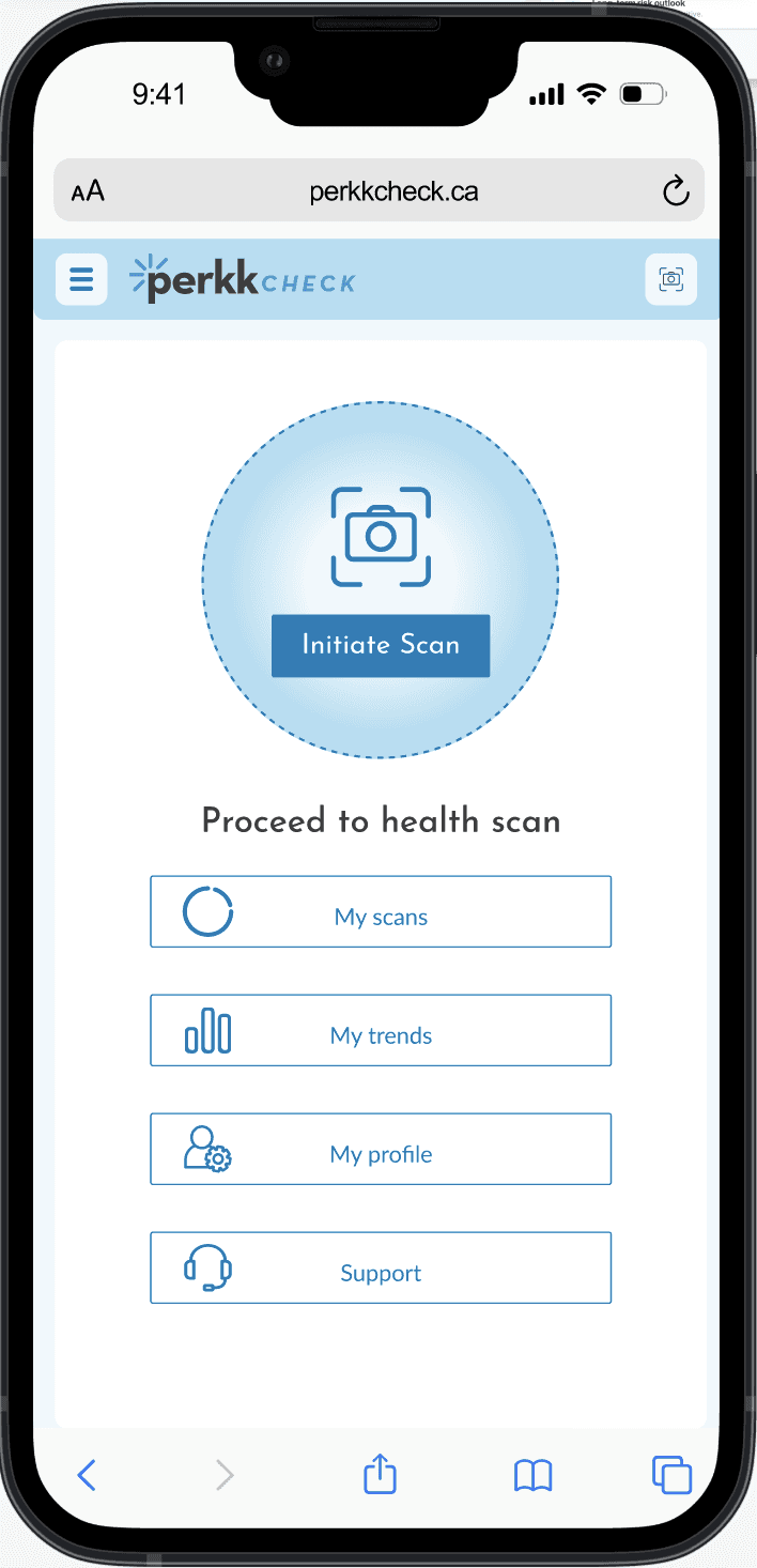
Iteration 1 — Navigation-first home What it was:
A simple hub that prioritized access to primary areas (Scans, Trends, Profile, Support) with a prominent prompt to begin scanning. Why it worked: Low complexity. Clear entry into the product. Minimal interpretation required. Where it broke down: It didn’t help users understand their current state or what mattered since their last check. It acted more like a menu than an orientation surface.
Iteration 2 — Metrics-forward dashboard What changed:
We introduced a results summary and surfaced multiple score categories on the dashboard. Why we did it: Users needed immediate feedback after returning, and the product needed a clearer “health at-a-glance” surface. What we learned: While this increased visibility, it also increased cognitive load. Too many equal-weight tiles made it harder to know what to focus on, and the dashboard began to feel like a report rather than guidance.
Iteration 3 — Orientation + follow-through What changed:
We simplified the hierarchy and gave the dashboard a clearer job: one summary anchor, one primary action (scan), and a small set of follow-through prompts (Today’s Focus / Habit plan / learning). Why it mattered: This version reduced visual competition, made next steps explicit, and supported repeat use without hiding detail elsewhere in the system. It also helped preserve trust by communicating calmly—highlighting what mattered without escalating tone.

Iteration 1
Navigation hub focused on access

Iteration 2
More visibility, but competing metrics increased cognitive load
Iteration 3
Single summary, clear next action and follow-through prompts.
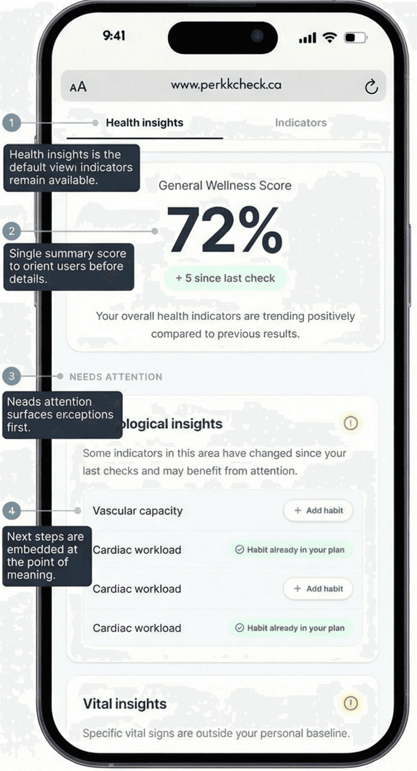
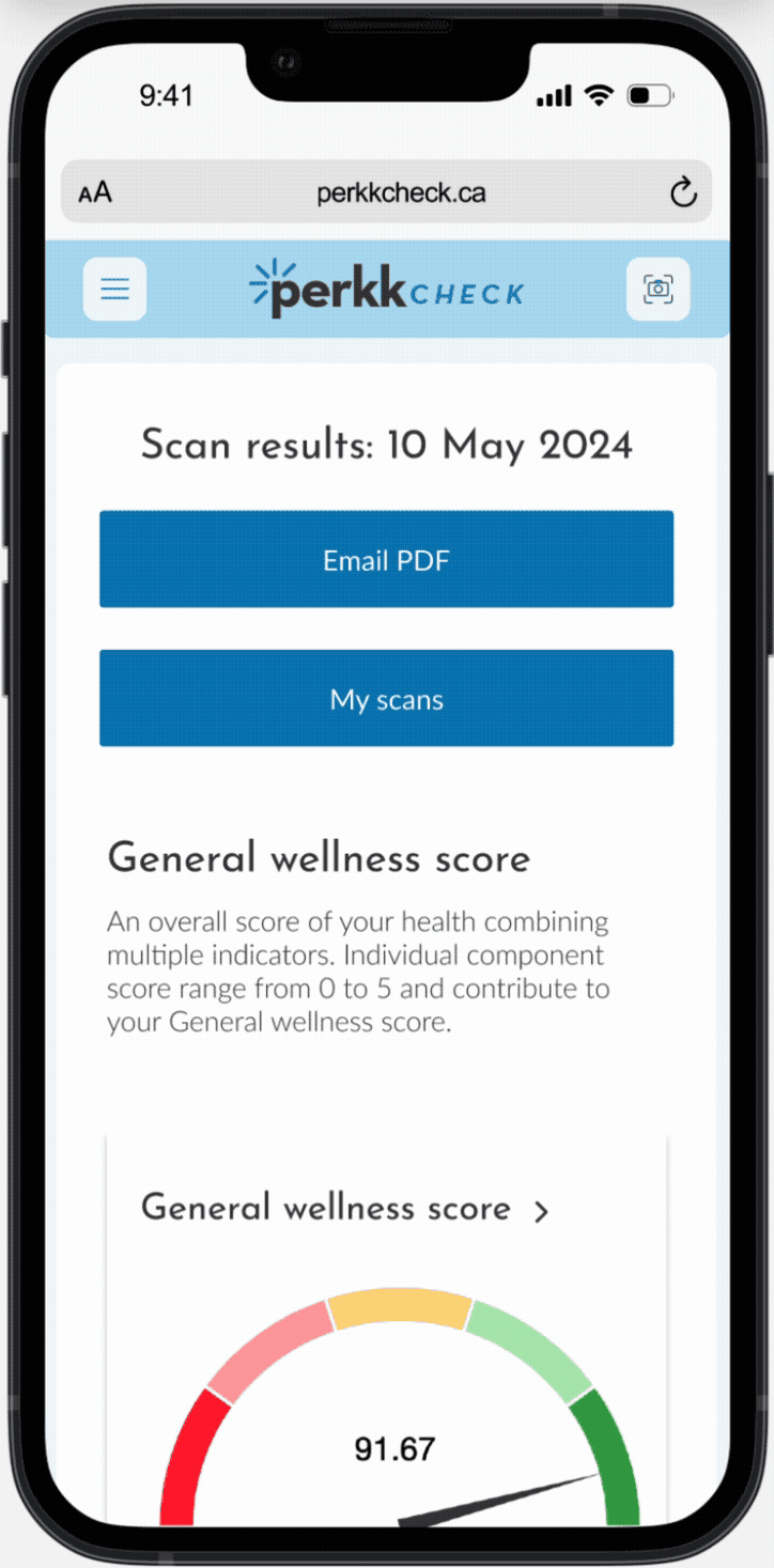
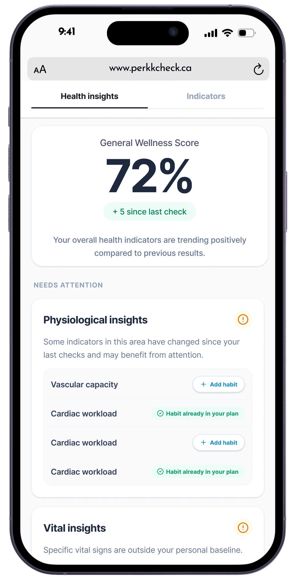
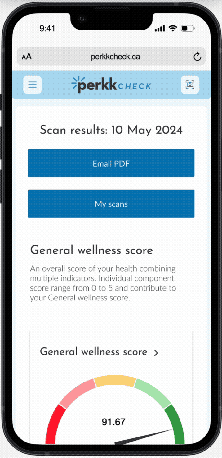
The results experience was redesigned as a system rather than separate pages. Health Insights became the default view to summarize priorities and provide context. Indicators remained available for transparency, but were redesigned to be more consistent with Insights and easier to read. To support follow-through, we introduced Habits as a lightweight plan tied to results—so users could move from “what does this mean?” to a practical next step without feeling alarmed or overwhelmed.
Outcomes
Established a more stable dashboard pattern across three iterations, improving how users orient and start a scan.
Made Health Insights the default post-scan experience, reducing the need to interpret raw metrics first.
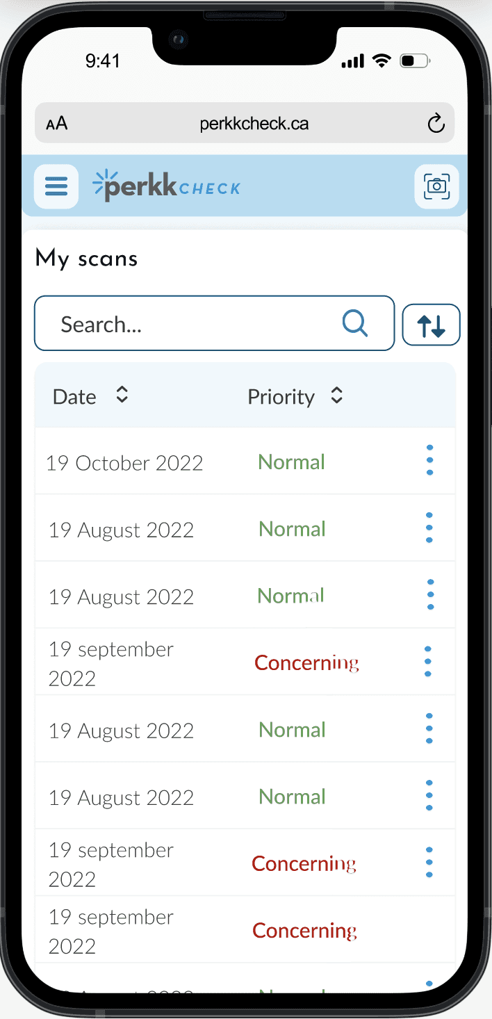
Reworked the Indicators view to match the Insights structure and improve readability while keeping full detail available.
Introduced Habits as a follow-through layer tied to results, giving users a practical next step and a repeatable plan.
Enabled faster delivery without fragmenting the experience by relying on shared components and consistent patterns.
Reflection
I approach work with a “succeed or learn” mindset. On Perkk Check, that meant placing small, defensible bets, shipping them, and letting real usage correct the design. The biggest lesson was that defaults are product strategy: what the system shows first, what it collapses, and how it frames concern determines whether users feel informed or overwhelmed. In a health context, clarity and calm are safety features, so I focused on consistent rules—hierarchy, language, and patterns—that preserved trust while making next steps explicit. The outcome wasn’t a single redesign, but a more coherent system that could evolve without drifting.
Related work


