Case Study
Details
Client
Numa
Year
2023–2024
My role
Product Designer (end-to-end). I owned the experience strategy, information architecture, interaction design, and UI system decisions.
Tools
Figma, FigJam, Miro, Jira, Confluence, Slack
Brief
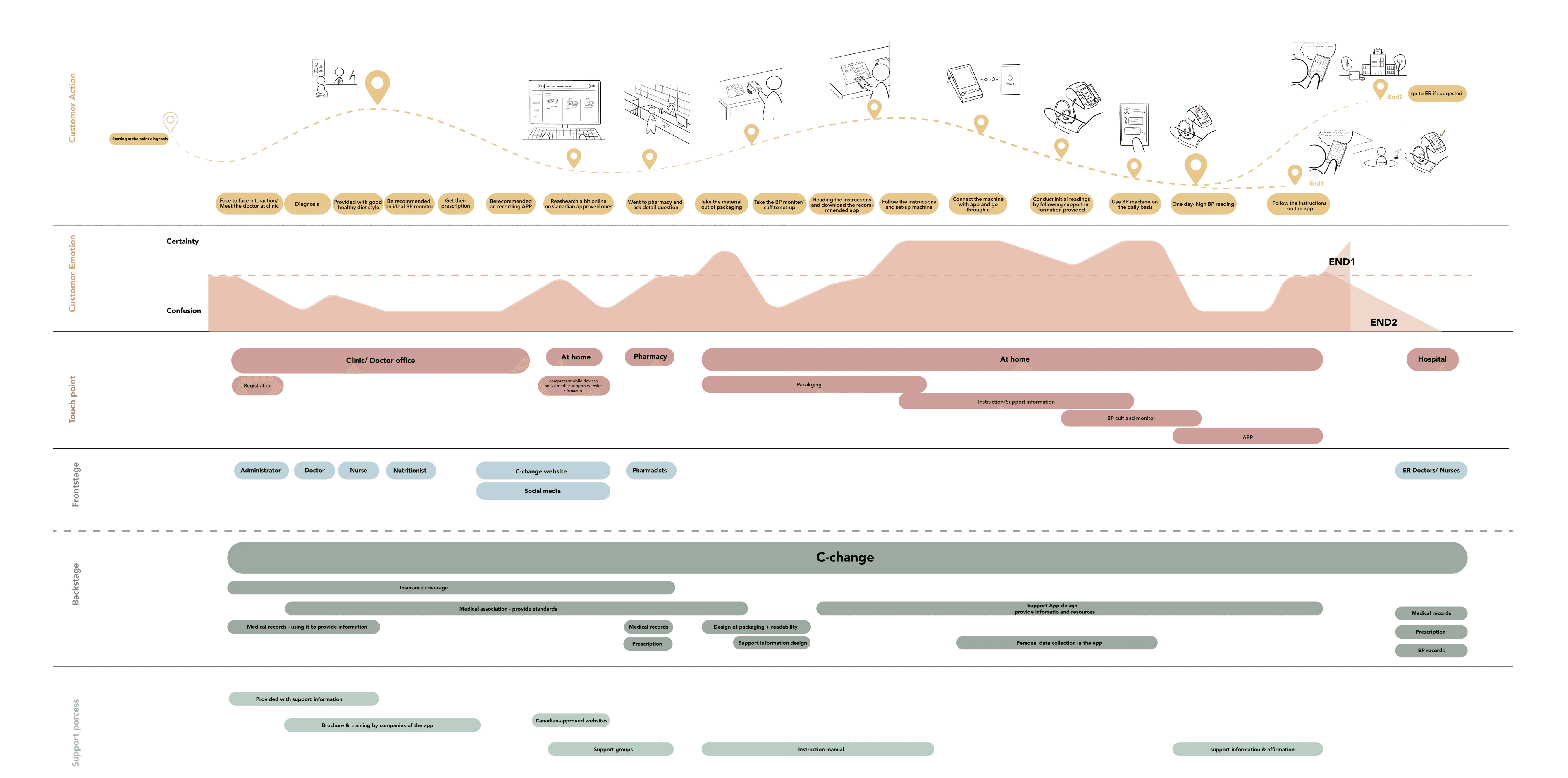
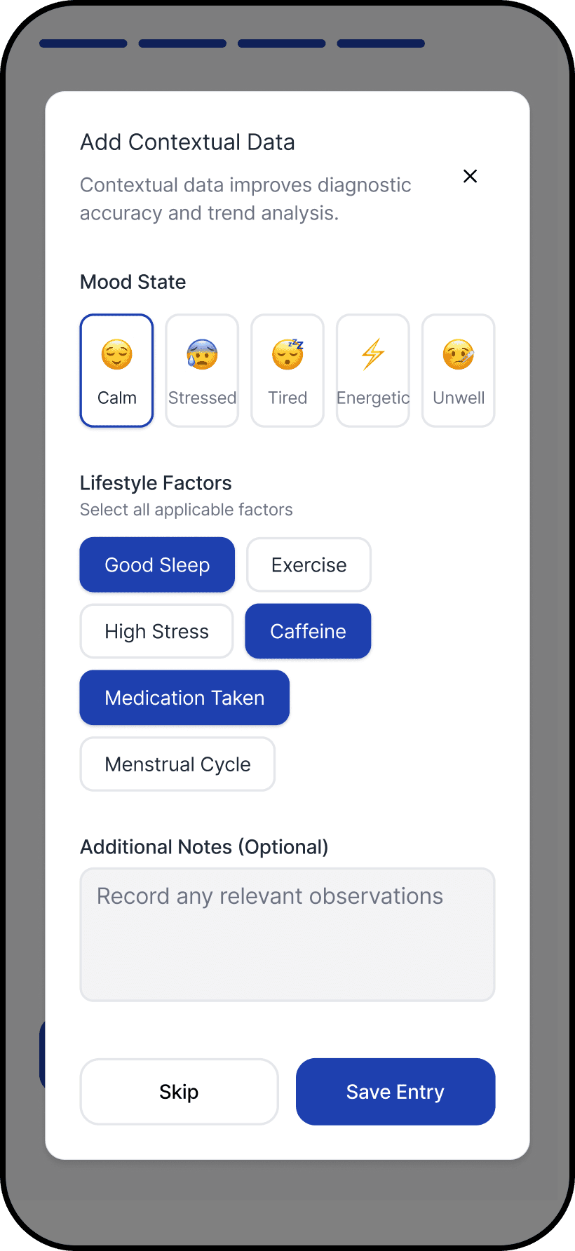
Numa is a home blood-pressure experience designed for the moment after a reading—when a number turns into a decision. When I joined, the concept and core measurement flow were established, but the experience still placed too much responsibility on the user: interpret the result, judge urgency, and decide what to do next. That gap matters because blood pressure is noisy. One elevated reading can be real, but it can also be technique, timing, or stress. Without context, users tend to overcorrect: retake repeatedly, search online, escalate unnecessarily, or avoid monitoring altogether. My work focused on turning measurement into an interpretable, repeatable system—one that supports better decisions over time while keeping transparency and clinical boundaries intact.
Problem & context
A single high reading can trigger panic, even when the right response is simply to retake and contextualize.
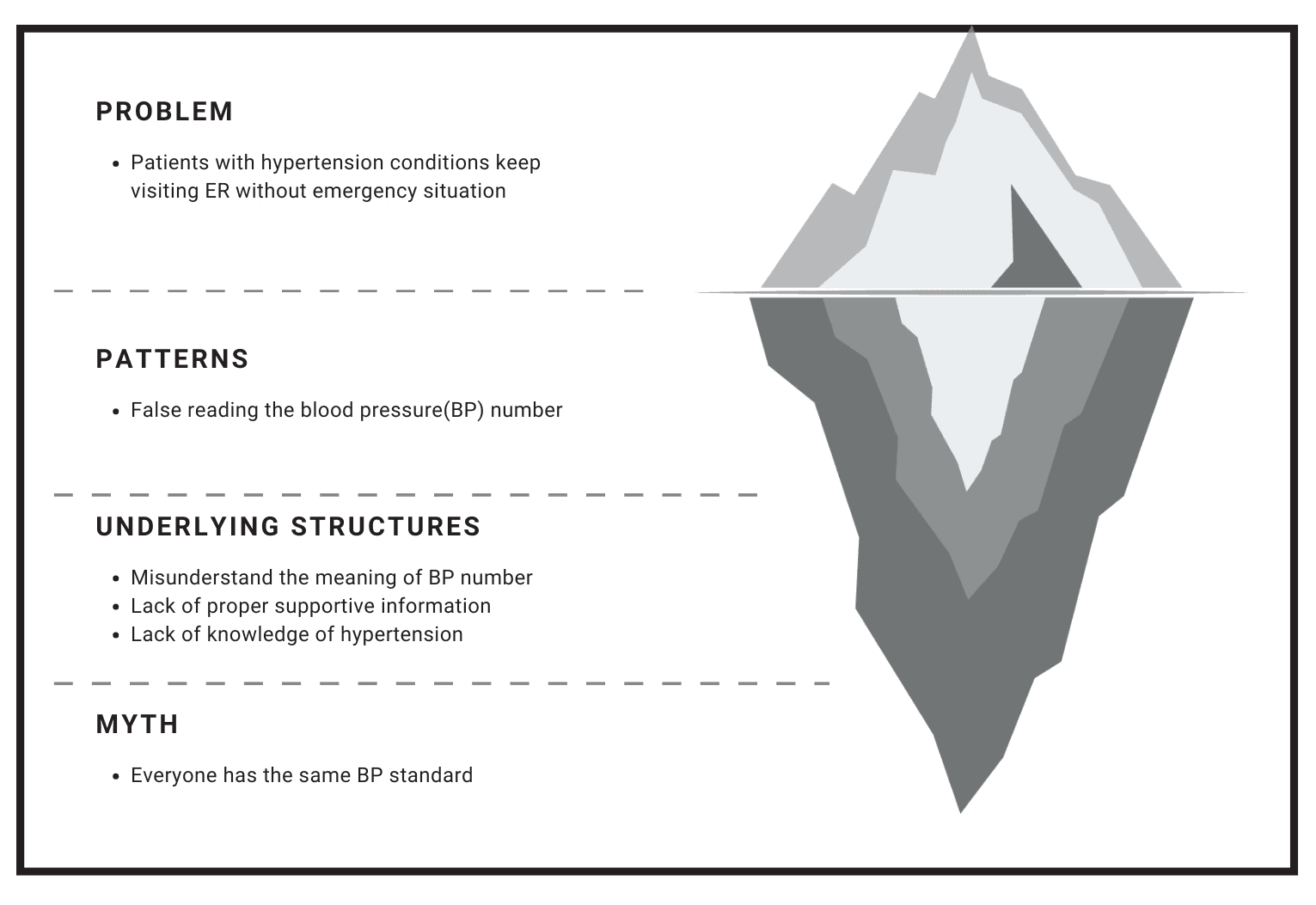
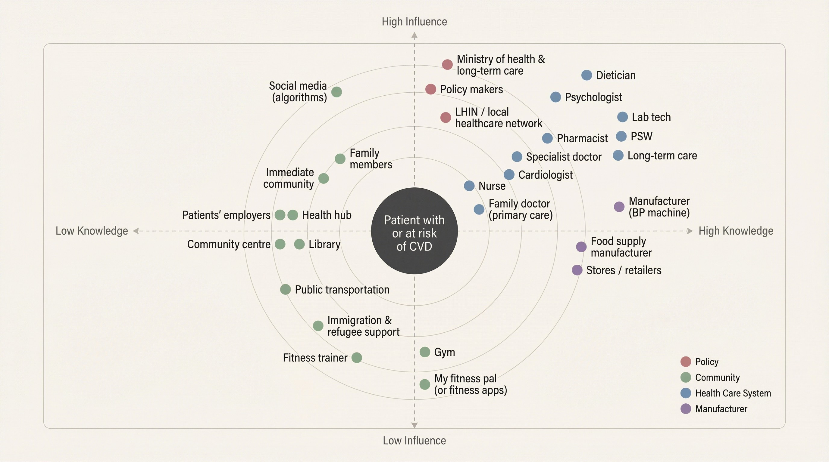
Home monitoring shifts clinical interpretation into a non-clinical setting. In a clinic, a reading comes with context: technique, baseline history, and professional judgment. At home, the same reading often arrives alone, and users fill the gap with emotion, assumptions, and whatever information is easiest to access. That’s why the “problem” isn’t just UI clarity—it’s decision quality.
We saw three recurring failure modes:
Uncertainty about correctness (Was the cuff placed right? Did I sit long enough?)
Uncertainty about meaning (Is this dangerous or just elevated?)
Uncertainty about action (Retake? Wait? Call someone? Go to the ER?)
The product needed to reduce those uncertainties without pretending to diagnose. The goal was not reassurance. It was structure: help users validate a reading, interpret it in context, and choose the next step that matches real risk.
Research
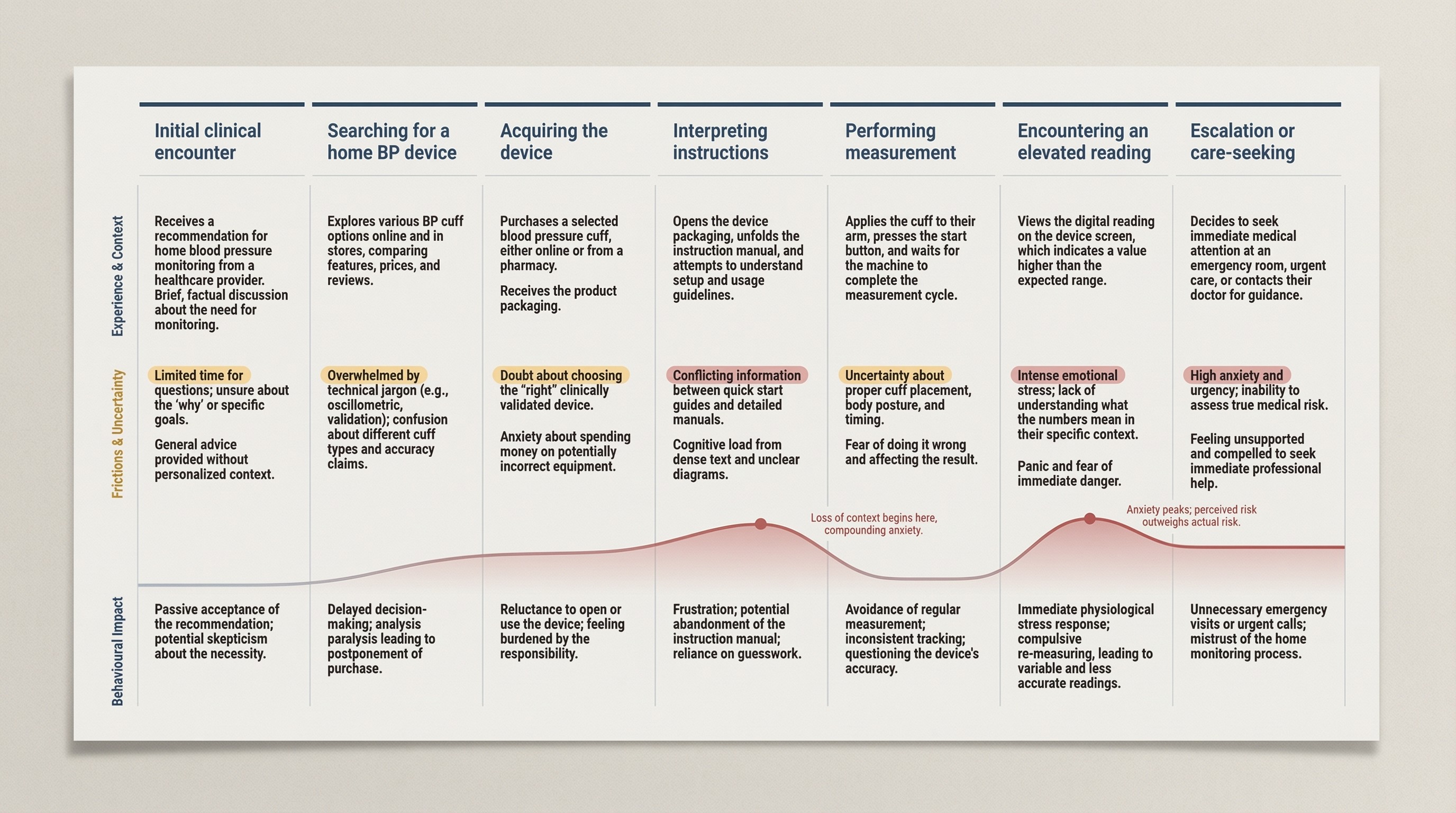
Our research showed that the biggest failure mode wasn’t taking a reading—it was interpreting it without context.
We ran research to understand why people misinterpret readings—not just whether they can use an app. Most blood-pressure tools assume the user already knows what the numbers mean and what “good behavior” looks like. Our research questioned that assumption and focused on where real-world conditions break it.
Insights
The consistent pattern was that people weren’t missing data—they were missing context, confidence, and a safe next step.
The biggest insight wasn’t “users want simpler UI.” It was this: a blood-pressure reading creates work. The number triggers interpretation, self-doubt, and a decision. When that work isn’t supported, users compensate in ways that make readings less reliable and decisions less appropriate.
What we learned:
Numbers without context invite worst-case thinking. Users tend to treat a single elevated result as a crisis, especially when they don’t know what variation is normal.
Technique uncertainty produces behavior spirals. Doubt leads to repeated measurements, which increases stress and can push results higher.
Most instructions fail under stress. Dense guidance is difficult to apply exactly when users need it most.
Trust is distributed across the system. When the product doesn’t help, users default to whatever source is fastest, not most reliable.
Single readings are noisy; patterns are meaningful. If the product doesn’t make trends easy, users make decisions on isolated data.
Design direction
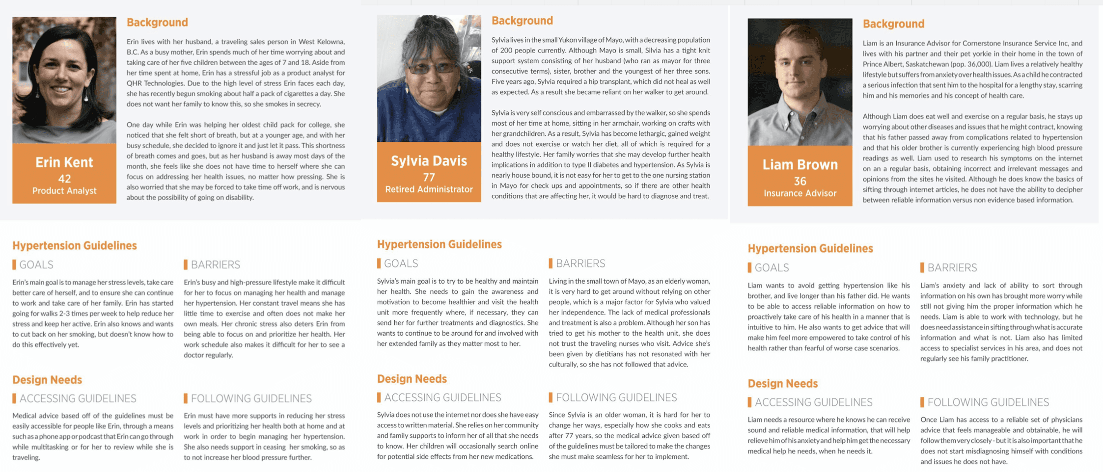
We treated interpretation as both an information problem and a trust problem—so we designed two archetypes to carry the experience.
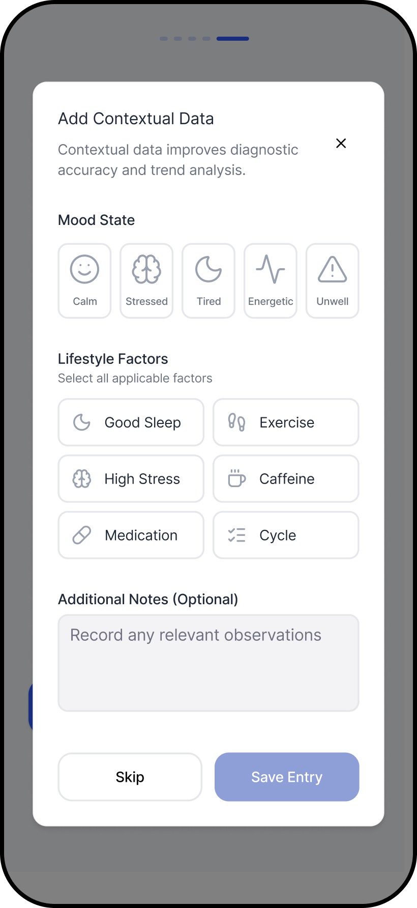
Research kept pointing to a consistent reality in healthcare: the same information can land as either reassurance or alarm depending on tone, framing, and perceived credibility. Early on, our assumptions about “what sounds clear” didn’t always match what users found trustworthy or supportive. Instead of forcing a single voice, we created two archetypes—each optimizing for a different trust signal—and used them as a design tool to make decisions about language, hierarchy, and guidance.
Archetypes
Scientist: clinical, structured, evidence-forward. Optimized for credibility and reduced ambiguity.
Companion: supportive, plain-language, steadying. Optimized for approachability and reduced anxiety.
How it shaped decisions
Meaning first: both archetypes lead with interpretation before raw metrics.
Bounded guidance: next steps are explicit without drifting into diagnosis.
Transparency preserved: detail remains accessible, but not the first burden.
User agency: users can choose the voice that helps them trust and follow through.
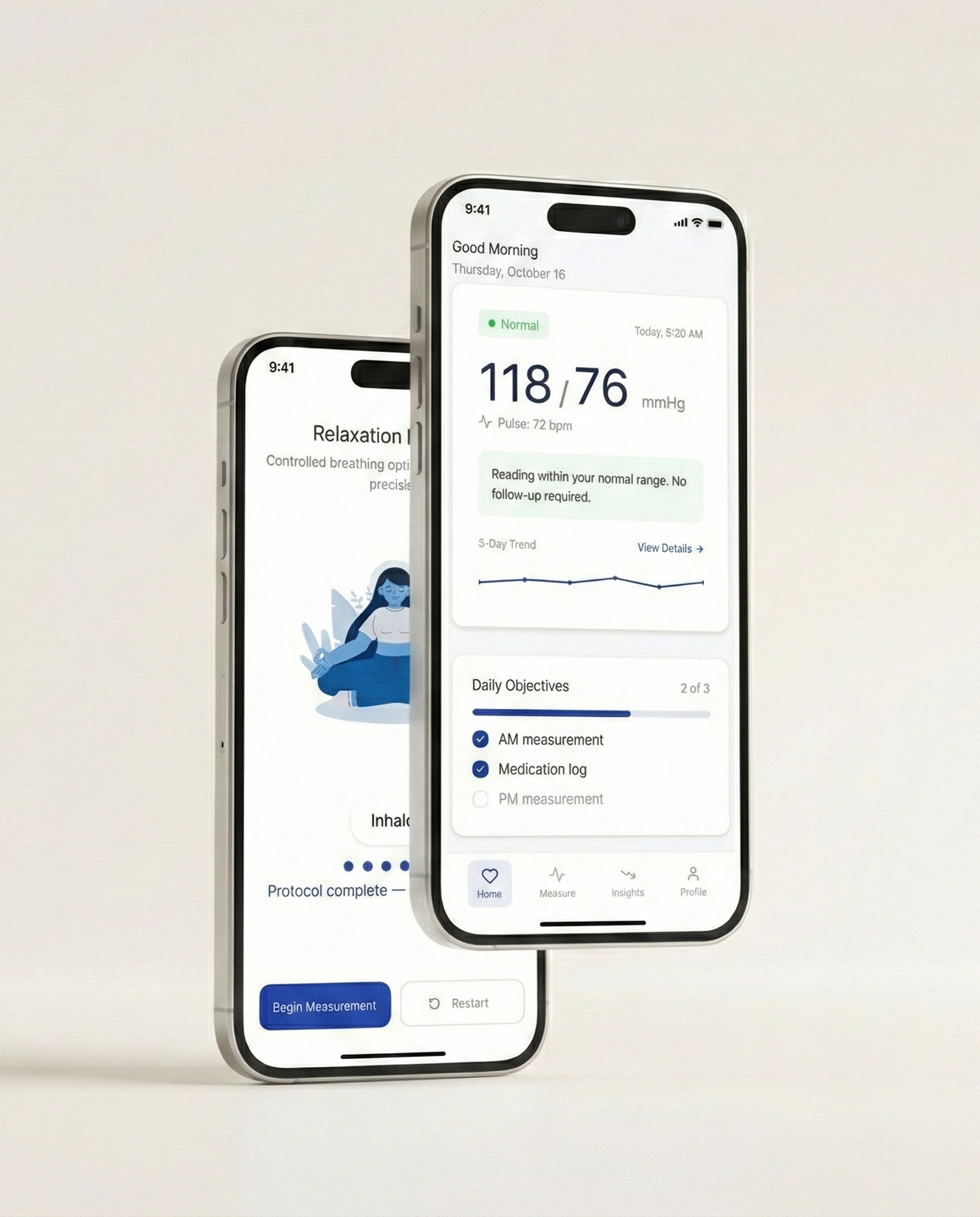
Solution
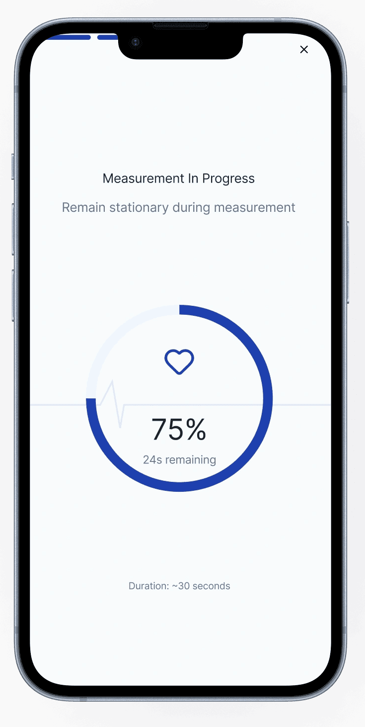
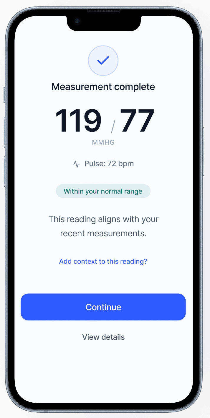
We designed for the moment after a reading—when a number turns into a decision.
The core breakdown wasn’t measurement. It was what happened next: users were left to judge correctness, urgency, and next steps alone. We introduced an interpretation-first structure that answers the questions users actually have in that moment: Is this reading reliable? What does it likely mean? What should I do now?
We then applied the archetypes to the same structure. The hierarchy stayed consistent, while the framing and language shifted to match different trust needs. Users responded well to having control over the archetype, even though it wasn’t the primary focus, because tone shaped whether guidance felt credible, supportive, or alarming.
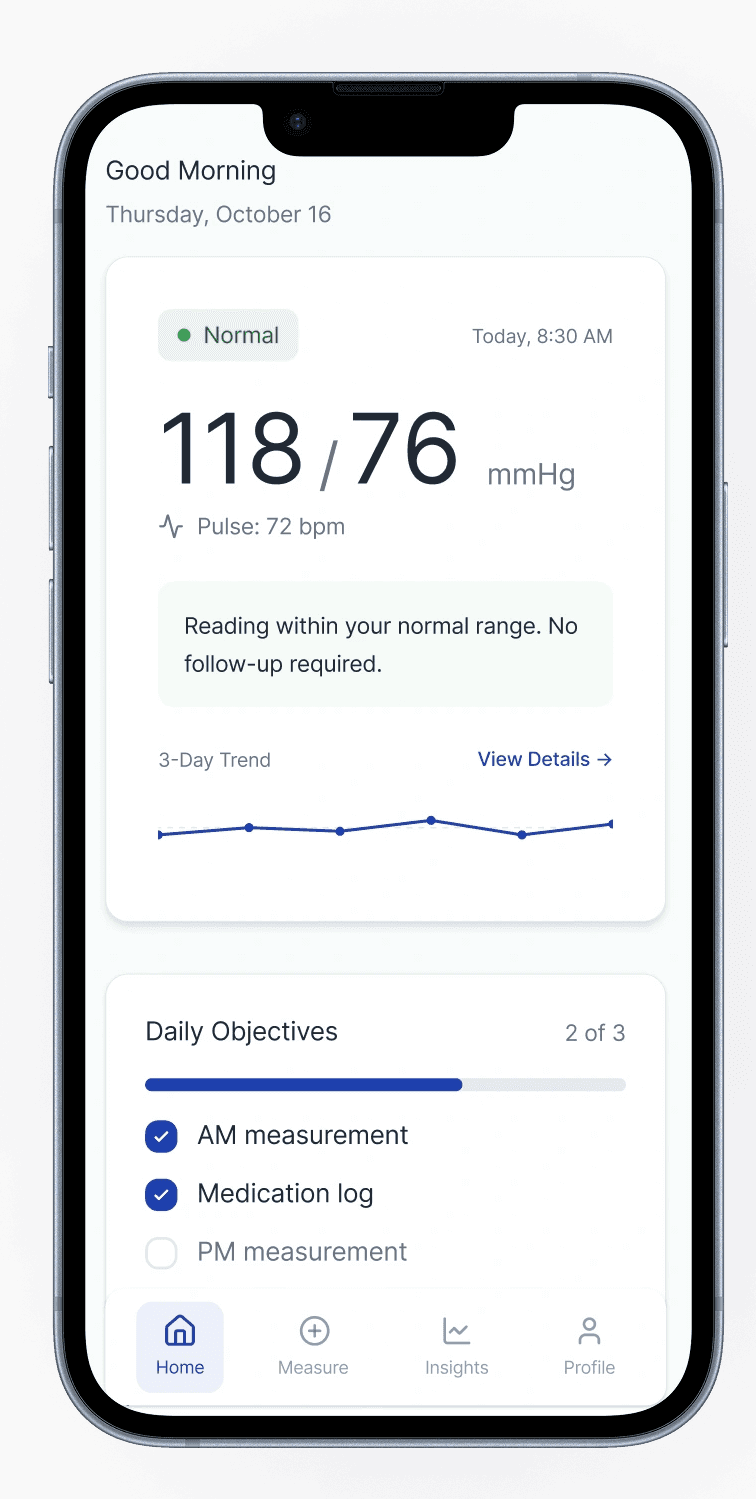
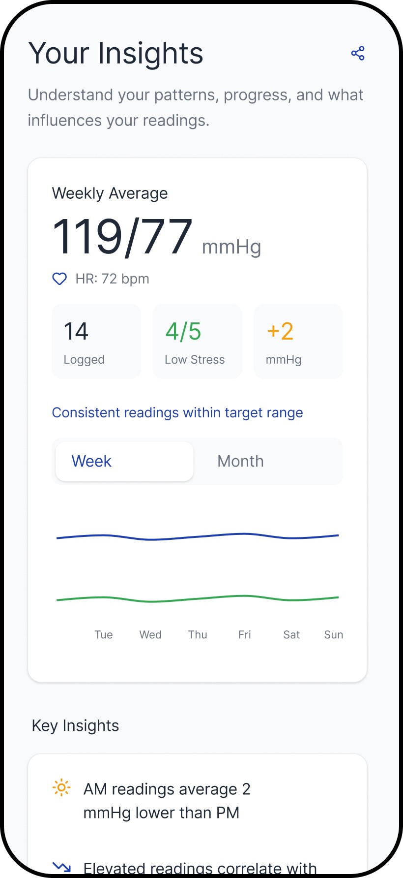
We designed tracking around patterns over time, so users don’t have to make decisions from a single reading.
Single readings are noisy. The tracking layer helps users build context through trends and repeat use, which reduces second-guessing and improves follow-through. The archetypes support the same behavior through different framing: one reinforces structure and measurement discipline, the other reinforces steadiness and adherence.
Outcomes
We designed for the moment after a reading—when a number turns into a decision.
This work shifted Numa from measurement output to decision support. The product moved toward:
A clearer post-reading structure (interpretation and next steps before detail)
Reduced dependence on users “figuring it out” through repeated measurement or online searching
Better support for ongoing monitoring through logging and trends
A system that preserves transparency without making raw metrics the entry point


Reflection
This project reinforced that decision support is not the same as advice—and the boundary has to be designed.
This project reminded me that healthcare design rarely rewards “getting it right” in one pass. Our early assumptions were challenged quickly once we put concepts in front of real people—especially around what language felt trustworthy, what level of detail created confidence versus anxiety, and where guidance started to feel like advice. We had to keep adapting in response to what users did and asked, not what we hoped they would understand, and that meant co-designing the experience with them over multiple iterations.
The learning I carry forward is that good healthcare UX is less about simplifying the interface and more about managing risk: making uncertainty explicit without escalating fear, keeping transparency available without forcing interpretation work onto users, and designing next steps that are supportive but bounded. It also reinforced a practical principle I use with teams: every release should either succeed or teach us something specific. In a domain where trust is earned slowly and lost quickly, the most reliable way to progress is disciplined iteration—tight feedback loops, careful wording, and systems that stay coherent as edge cases surface.
Related work


