Showing progress
Research raised questions about the measurement itself, as well as the result. I treated the time spent taking a reading as part of the experience, with a visible progress state so people could tell what was happening.
Numa
C-CHANGE × Sunnybrook · Health Design Studio
Numa is a proposed product for monitoring blood pressure at home. C-CHANGE and Sunnybrook Health Sciences Centre brought the project to the Health Design Studio, where I was working at the time. I led a six-person team through five months of research, design and prototyping.
01 / Introduction
The Circulate project asked us to interpret cardiovascular-care research, reframe the problem and propose a feasible product direction. I chose to approach it through the patient experience: what happens at home, around the measurement itself?
I led the project and product direction, including the Scientist and Companion archetypes that shaped the product’s voice. The team included two UX designers, a researcher, a UI designer, an industrial designer and me. UX and UI execution were shared across the team. The researcher led the studies and testing; the industrial designer led the hardware recommendation.
02 / Research
I helped frame the questions the research needed to answer, then used the findings to guide the product strategy. The work focused on uncertainty around taking a measurement, understanding it and deciding what to do next.
03 / Problem
People monitoring blood pressure at home needed help with more than the reading itself. They were uncertain about how to take a measurement, what the number meant and what to do next. Our task was to turn those needs into a product direction that could support the experience at home.
04 / Direction
Testing showed that the same information could be received differently depending on its tone and framing. I proposed two archetypes to guide the team’s decisions about language and presentation. They gave the team something concrete to compare when choosing language and visual treatment. We could explore a clinical or a more supportive tone while keeping the underlying health information consistent.
A clinical, data-forward direction for people who wanted explicit detail and a clear view of the information behind a reading.
Prototype example · Seated position
“Sit upright, feet flat, back supported.”
A warmer, plain-language direction for people who preferred supportive explanations and a sense of routine.
Prototype example · Seated position
“Sit comfortably with your back supported and feet flat.”
Both examples describe the same preparation step. We used these directions to discuss how to explain it in the prototype, keeping the health information consistent in both.
05 / Measurement
The prototype connected measurement, the result and a next action. I kept the reading easy to find and placed its explanation directly below, with an option to add context and access to further detail.
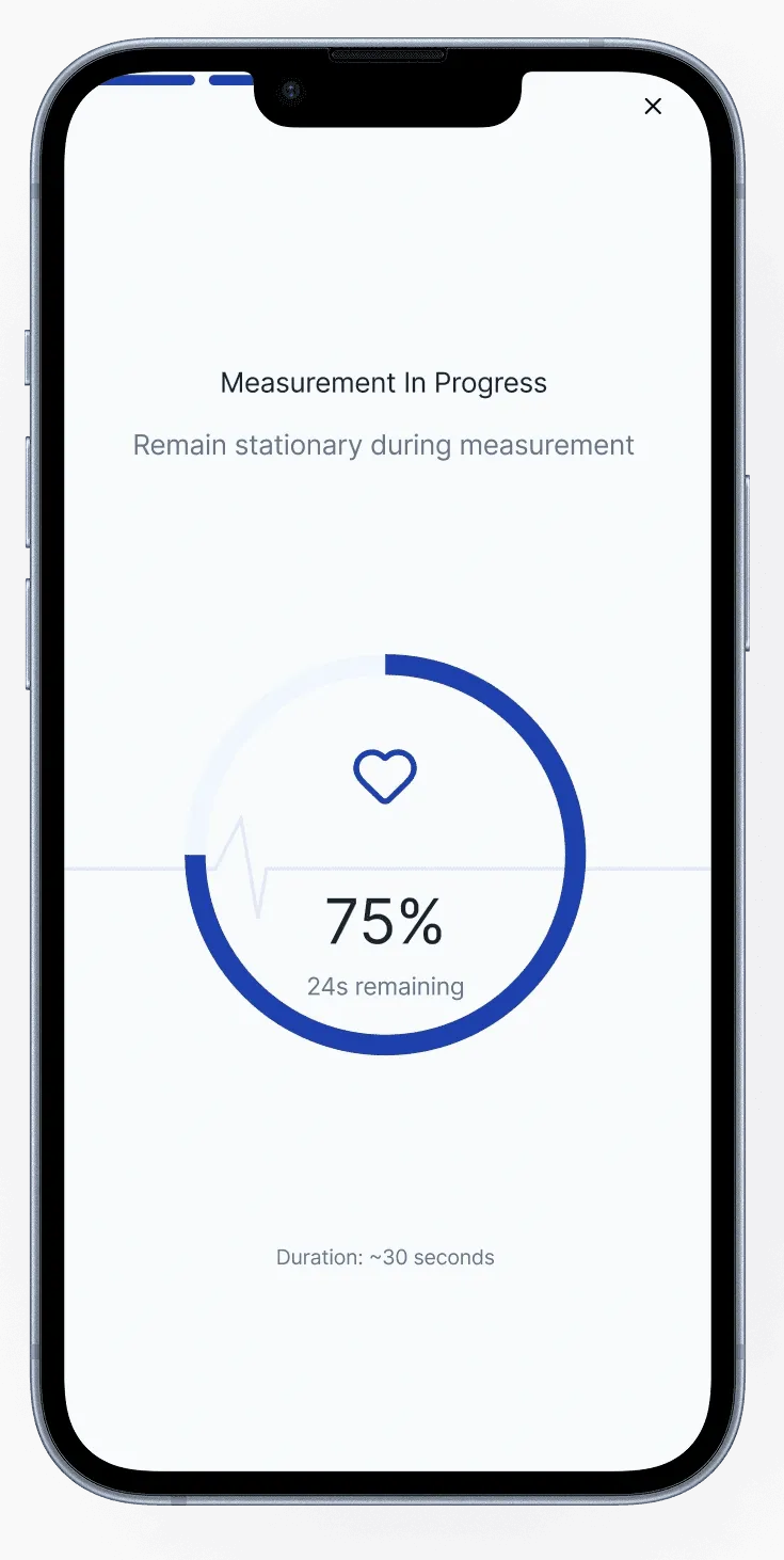
Measurement in progress
A progress state keeps the person informed while the measurement is being taken.
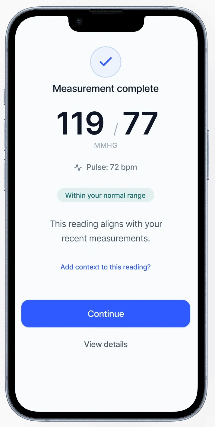
Result and explanation
The result screen brings the reading and its explanation together, with room to add context.
From measurement to explanation
Research raised questions about the measurement itself, as well as the result. I treated the time spent taking a reading as part of the experience, with a visible progress state so people could tell what was happening.
People wanted to understand what a reading meant and what came next. I kept the explanation close to the number, while leaving further detail available to people who wanted it. The Scientist and Companion directions helped us explore how to explain the same information in different ways.
06 / Tracking
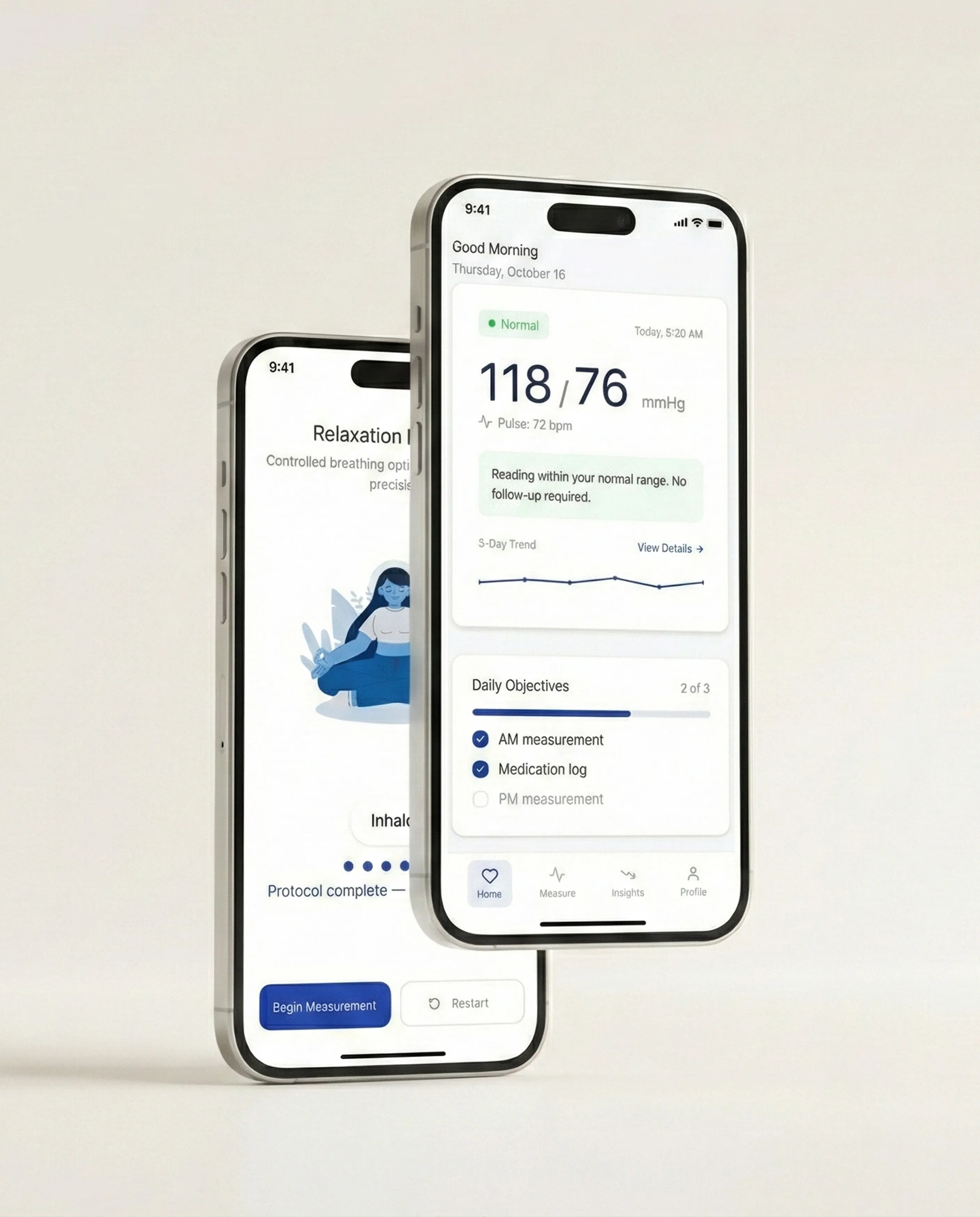
The experience also needed to work between measurements. The home screen combined the latest reading with daily objectives, while Insights brought readings together over time. Context logging was part of the proposed flow, allowing people to add information alongside a reading.
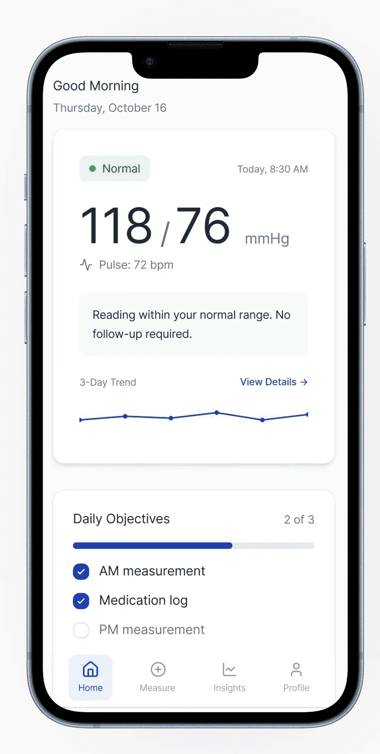
Companion home screen
The latest reading, a short trend and daily objectives sit together in one starting point.
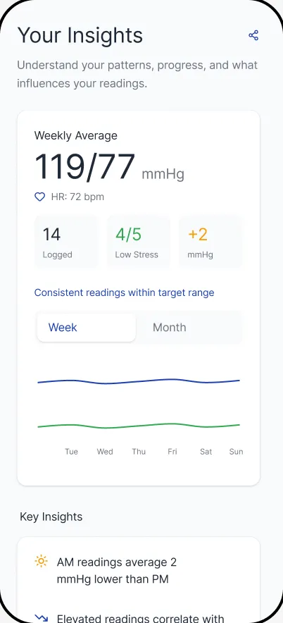
Insights · prototype viewport
The weekly summary and trend are visible here. The Insights page continues below the viewport.
07 / Delivery
At the end of the five months, the team delivered a strategy document, a digital product prototype with a front-end MVP, and a hardware recommendation. I contributed to the strategy document; another team member wrote it. My main responsibility was leading the digital product direction and the team’s work.
The team’s researcher tested the digital experience with users. The engagement ended with a tested prototype and a proposed product direction for the client to develop further.
Language we expected to be clear could feel alarming or patronizing in testing. I had to reconsider wording that had seemed straightforward to us. The archetypes gave the team a shared way to discuss those differences and revise the language alongside the flow and visual hierarchy.
KEEP EXPLORING
All work